Cricket Metrics
INFO 526 - Spring 2024 - Project Final
Anjani Sowmya, Alexander Berliner, Navya Reddy, Nandhini Anne, Srinivasan Poonkundran, Tejas Bhawari, Mohit Rakesh Taparia
Introduction
- Our project’s goal is to create a dynamic dashboard that simulates a live cricket match experience utilizing historical data.
- The dashboard uses mocked live data updates to present vital insights into several areas of cricket matches and team dynamics.
- The project uses automatic data refreshes and API-driven analytics to manage live dataset problems, improve comprehension of cricket trends, and showcase cost-effective real-time sports analytics.
Understanding the Data set
Extracted data from the data-set “ODI Men’s Cricket Match Data (2002-2023)“ sourced from Kaggle.
From the original data-set we extracted two subsets:-
The data-set includes match details, innings data, player performance, match outcome, and umpire details.
Question 1:
What is the performance of top 10 Batsmen?
A. Scoring evolution over the match and top 10 batsman for each match?
B. Top 10 batting percentage for each year?
Question 2:
How do the running scores differ by countries over the years?
A. The total runs scored by each country?
B. The runs scores by different countries over the years?
C. The partnership of different batsman over each season.
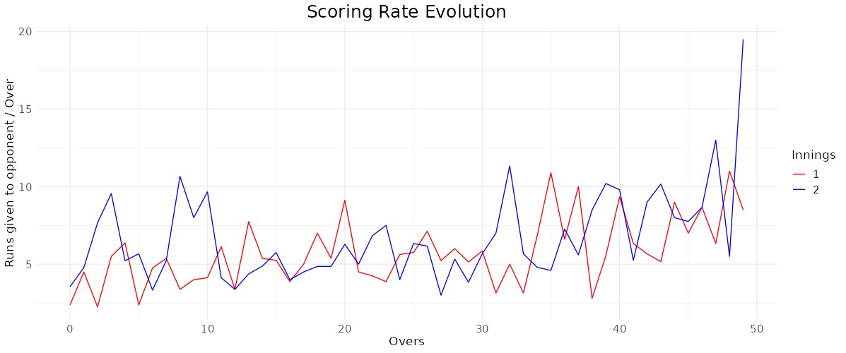
Question 1 - A
- The “Scoring Rate Evolution” graph shows the number of runs provided to the opponent per over throughout two different innings of a cricket match.
- The red line shows the scoring rate in the first innings, while the blue line indicates the scoring rate in the second innings.
- The graphic indicates that both innings have variable scoring rates, with many peaks indicating overs with very high scoring.
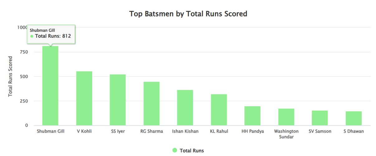
Question 1 - B
- The bar chart shows ranks for batsmen based on the total runs they scored during the selected cricket season (2022/23).
- The batsmen are displayed along the x-axis with their corresponding runs on the y-axis.
- This could allow for inferences concerning whether specific genres of media are inherently built with introverted or extroverted characters.
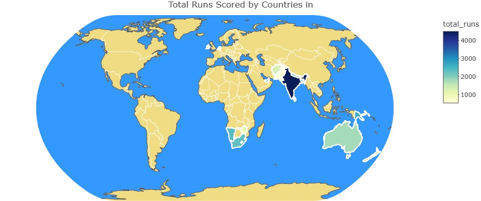
Question 2 - A
- The map illustrate the total runs scored by countries in the 2022/23 cricket season, using a color gradient to represent the data.
- The color scale ranges from light yellow (1000 runs) to dark blue (2000 runs), indicating the volume of runs scored.
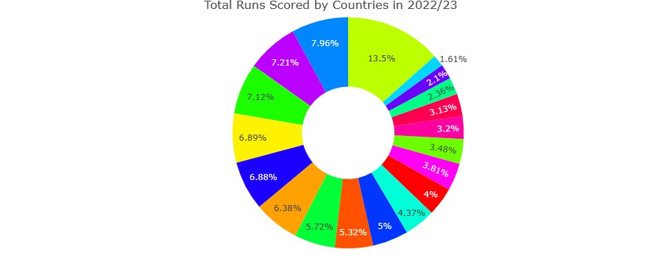
Question 2 - B
- The Donut chart represents the percentage distribution of total cricket runs scored by different teams in the 2022/23 season.
- This visualization highlights the dominance of the leading team in run-scoring compared to the others in different seasons.
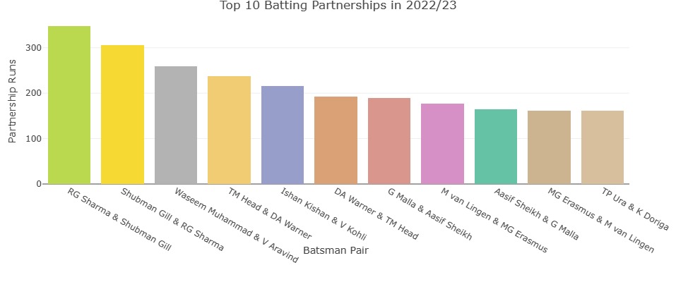
Question 2 - C
- This bar chart represents the top 10 batting partnerships in terms of runs scored during the 2022/23 cricket season.
- Each pair of batsmen is represented by a different color and labeled under the chart.
- The chart effectively shows the variability and success of different batting combinations in contributing significant runs to their teams’ totals.
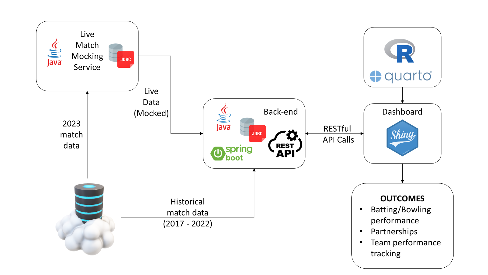
Implementation:
![]()
Conclusion
- Our project demonstrated the successful integration of data visualization tools and APIs to simulate a live cricket match experience.
- Through rigorous data analysis, we provided deep insights into scoring rates, batting and bowling performances, and the strategic impacts of partnerships.
- By mimicking live data updates, our project delivered a cost-effective yet realistic approach to sports analytics.