Data Dazzlers: Sanja Dmitrovic, Jiayue He, Vidhyananth Sivashanmugam, Naitik Shah, Varun Soni, Mohammad Ali Farmani
School of Information, University of Arizona
Abstract
In this project, we look into car accident data from the city of Tucson’s police department, which provides substantial data on car accidents from 2018 - 2023. We aim to offer detailed insights into these car accident data by developing an interactive, user-friendly Quarto dashboard. This dashboard will allow users to access statistics related to the frequency, severity, and causes of traffic accidents across different times and locations in Tucson. The goal is to help various stakeholders such as city planners, policy-makers, local residents, and fellow students think of measures to improve road safety.
Introduction
In response to the critical issue of road safety in Tucson and as students at the University of Arizona, located in the heart of Tucson, we propose to develop a dynamic and user-friendly Quarto dashboard that offers detailed insights into the frequency, severity, and causes of traffic accidents across different times and locations in Tucson. We aspire to contribute to informed decision-making processes and the implementation of effective road safety measures.
Analyzing traffic collision data within the city not only allows us to apply the theoretical knowledge we’ve gained in our data analysis courses, but we can also provide insights into urban safety and transportation issues that affect peers and fellow residents. This project is not just an academic exercise; it’s a chance to contribute to a safer, more informed Tucson.
The project utilizes the comprehensive accident crash data set provided by the Tucson Police Department, GIS Data from the City of Tucson, which displays Tucson Police’s publicly-available records of vehicle collisions from 2018 to 2023. Example variables in this data set include date of collision, injury severity, manner of collision, if the collision was fatal, etc. A full list of these variables is provided below.
Overall Project Plan
For this project, we follow these four steps to create a user-friendly, interactive Quarto dashboard:
Data Preparation and Analysis
Development of Interactive Visualizations
Accessibility and User Experience
Outreach and Impact
Project Questions
Specially, we focused on two main questions:
Does day of the week and/or time of day affect severity and the number of accidents?
What is the relationship between the type of violation (e.g., failure to yield, aggressive driving) and if the accident resulted in a fatality?
Question 1
Does day of the week and/or time of day affect severity and the number of accidents?
Approach: We use time series and heat map plots to see which months, days, and times accidents occur more frequently.
First, a monthly time series categorized by year is created to see monthly and yearly trends in accident frequency.
Analysis: We find that 2019 is the year with the highest frequency of car accidents and 2020 is the year with the lowest frequency of car accidents. The decrease in accidents in 2020 is most likely due to COVID (April 2020 was first shutdown month), where fewer people were commuting in general. Also, there is a lower amount of accidents between May and August compared to the other months. This could be attributed to not as many people commuting to school since these months are considered summer break. We see more accidents occurring in October and April, which could be due to holidays such as Halloween and Spring Break.
Then, an hourly heat map categorized by day is plotted to observe peak times and days for accidents.
Analysis: Based on the plot, we found that during the week, time period from 13:30 to 18:30 more accident happens, one possible reason is that between this period of time, many parents would go out to pick up their children between 13:30 - 16:30. And during the period of 16:30 - 18:30 is the peak hour of people get off from the work. The second time period of more accident happens is between 6:30 to 8:30 which is also the peak hour when people go to the work. Therefore, drivers should be more careful during the peak hours, or if possible, people can also avoid getting out during the peak hours. We also see that fewer accidents occur in general over the weekend, so more caution must be taken on weekdays.
Question 2
What is the relationship between the type of violation (e.g., failure to yield, aggressive driving) and if the accident resulted in a fatality?
Approach: We use a heat maps and bar plots to see the relationship between the type of violation and the resulted injury, including if the injury was fatal. First, the total number of injuries per injury type is shown in a bar plot.
Analysis: We see that 50.2% of drivers do not get injured from an accident, but 49.8% do. The most common injury type is non-incapacitating injury followed by possible injury. It is also seen that 1.6% of accidents do result in a fatal injury.
Then, a heat map is plotted to observe the cause of injury severity to see which types of accidents lead to which types of injuries.
Analysis: Based on the plot, we found that left turns caused the most accidents including the highest fatal injury. Usually, left turn is allowed during the green light which also allows straight cars to cross, so many people who turned left might neglect the coming cars. It suggested that when drivers turn left, they should be more careful.
Then, another bar plot is created to look at the amount of fatalities by violation type.
Analysis: Based on the plot, we found that violations occurring due to speed , crosswalk , and failure to yield have higher fatalities.
Finally, various pie charts are plotted to see the percentage of accidents occurring per violation/operator type such as the accident occurring at an intersection or if the driver was speeding, distracted, or impaired.
Analysis: From these various pie charts, we see that 74.7% of accidents occur at an intersection, 18.5% due to the driver speeding, 6.9% due to the driving being impaired, and 38.1% due to the driver being distracted. Based on these results, we recommend that drivers take particular caution at intersections. It might also be beneficial to enforce stricter regulations on distractions such as being on the phone.
Conclusion
We demonstrate a successfully-designed Quarto dashboard that allows the user to see a substantial amount of statistics related to car accidents in Tucson. With a deep commitment to applying our analytical skills for the betterment of our community, we believe that this project represents a meaningful opportunity to make a tangible difference in the area of road safety in Tucson. We are excited about the potential of our interactive spatiotemporal visualization tool to inform Tucson drivers on best driving practices that can lead to positive changes in our community.
Source Code
---title: "Tucson Car Collision Analysis"subtitle: "INFO 526 - Project Final"author: - name: "**Data Dazzlers**: <br> Sanja Dmitrovic, Jiayue He, Vidhyananth Sivashanmugam,<br> Naitik Shah, Varun Soni, Mohammad Ali Farmani" affiliations: - name: "School of Information, University of Arizona"description: "Project description"format: html: code-tools: true code-overflow: wrap embed-resources: trueeditor: visualexecute: warning: false echo: false---```{r, warning=FALSE, message=FALSE}#| label: load-pkgs#| message: false#| include: false if(!require(pacman)) install.packages("pacman")pacman::p_load( tidyverse, dlookr, kableExtra, reader, scales, gt, DT, janitor, stringr, leaflet, highcharter, htmlwidgets )``````{r}#| label: setup#| include: false# Plot themeggplot2::theme_set(ggplot2::theme_minimal(base_size =11))# For better figure resolutionknitr::opts_chunk$set(fig.retina =3, dpi =300, fig.width =8, fig.asp =0.618 )```## AbstractIn this project, we look into car accident data from the city of Tucson's police department, which provides substantial data on car accidents from 2018 - 2023. We aim to offer detailed insights into these car accident data by developing an interactive, user-friendly Quarto dashboard. This dashboard will allow users to access statistics related to the frequency, severity, and causes of traffic accidents across different times and locations in Tucson. The goal is to help various stakeholders such as city planners, policy-makers, local residents, and fellow students think of measures to improve road safety.## **Introduction**In response to the critical issue of road safety in Tucson and as students at the University of Arizona, located in the heart of Tucson, **we propose to develop a dynamic and user-friendly Quarto dashboard** that offers detailed insights into the frequency, severity, and causes of traffic accidents across different times and locations in Tucson. We aspire to contribute to informed decision-making processes and the implementation of effective road safety measures.Analyzing traffic collision data within the city not only allows us to apply the theoretical knowledge we've gained in our data analysis courses, but we can also provide insights into urban safety and transportation issues that affect peers and fellow residents. This project is not just an academic exercise; it's a chance to contribute to a safer, more informed Tucson.The project utilizes the comprehensive accident crash data set provided by the Tucson Police Department, [GIS Data from the City of Tucson](https://gisdata.tucsonaz.gov/datasets/tucson-police-collisions/explore "Dataset link"), which displays Tucson Police's publicly-available records of vehicle collisions from 2018 to 2023. Example variables in this data set include date of collision, injury severity, manner of collision, if the collision was fatal, etc. A full list of these variables is provided below.```{r}#| label: load-data#| message: false#| echo: false#| results: hideboolan_tranform <-function(vector) { result <-ifelse(vector ==1, "Yes", "No")return(result)}# read datacars_data <-read.csv("data/tucson_data.csv") |>clean_names() |>mutate(collision_date =format(ymd_hms(collision_date), "%m/%d/%Y"), # Clean date typeyear = year_occu,month =as.factor(month_abbr),month_no =as.factor(month_occu),day =as.factor(day),hour =ifelse(time_occu ==0,"12:00 AM",ifelse(nchar(as.character(time_occu)) ==3,paste0(substr(as.character(time_occu), 1, 1), ":", ... =substr(as.character(time_occu), 2, 3), " AM"),format(strptime(as.character(time_occu), format ="%H%M", tz ="UTC"), format ="%I:%M %p"))),weekday =if_else(day %in%c("Saturday", "Sunday"), "Weekend", "Weekday"),offense_desc =if_else(str_detect(offense_desc, "^\\s*$"), "Unknown", offense_desc),offense_desc_main =str_split_fixed(offense_desc, ":", n =2)[, 1],offense_desc_sub =if_else(str_detect(str_split_fixed(offense_desc, ":", n =2)[, 2], "^\\s*$"),"Other", str_split_fixed(offense_desc, ":", n =2)[, 2]),offense_type =as.factor(case_when(str_detect(offense_desc_main, "Fatal") ~"Fatal Accidents",str_detect(offense_desc_main, "Injury") ~"Injury Accidents",str_detect(offense_desc_main, "Property Damage") ~"Property Damage Accidents",str_detect(offense_desc_main, "Driving Under the Influence") ~"DUI Accidents",str_detect(offense_desc_main, "Non-Traffic") ~"Non-Traffic Accidents",str_detect(offense_desc_main, "Other") ~"Other Vehicle Accidents",TRUE~"Miscellaneous Accidents" )),collision_manner =as.factor(gsub("Rear End", "Rear-End",collision_manner)),collision_type =as.factor(if_else(str_detect(collision_type, "^\\s*$"),"Unknown", collision_type)),in_out_vehicle =as.factor(case_when(grepl("Pedestrian|Bicycle|Parked_Unit|Single Pedestrian", collision_type, ignore.case =TRUE) ~"Out of Vehicle",grepl("Vehicle|Motorcycle|Bus|Train", collision_type, ignore.case =TRUE) ~"In Vehicle",TRUE~"Unknown")),distance =if_else(str_detect(distance, "^\\s*$"), "Unknown", distance),traffic_control_device =boolan_tranform(traffic_control_device),work_zone =boolan_tranform(work_zone),violation_too_close =boolan_tranform(violation_too_close),violation_traffic_control_device =boolan_tranform(violation_traffic_control_device),violation_turning =boolan_tranform(violation_turning),violation_wrong_way =boolan_tranform(violation_wrong_way),violation_lane =boolan_tranform(violation_lane),violation_crosswalk =boolan_tranform(violation_crosswalk),violation_failure_to_yield =boolan_tranform(violation_failure_to_yield),violation_aggressive_driving =boolan_tranform(violation_aggressive_driving),collision_neighborhd =if_else(str_detect(collision_neighborhd, "^\\s*$"),"Uknw", collision_neighborhd), collision_direction =if_else(str_detect(collision_direction, "^\\s*$"),"Unknown", collision_direction), accident_location =if_else(str_detect(accident_location, "^\\s*$"),"Unknown", accident_location), injury_severity <-as.factor(injury_severity), division <-as.factor(division) ) |>select(accident_id, collision_date, year, month, month_no, day, weekday, hour, time_occu, offense_desc_main, offense_desc_sub,offense_type, injury_severity, collision_type, collision_manner, division, distance, hitand_run, pedestrian, fatal_collision, intersection_related, traffic_control_device, work_zone, violation_speed, total_injuries, latitude, longitude, violation_too_close, violation_traffic_control_device,violation_turning, violation_wrong_way, violation_lane, violation_crosswalk, ward, violation_failure_to_yield, violation_aggressive_driving, operator_impaired, operator_distracted, x_coordinate, y_coordinate, total_fatalities, collision_neighborhd, collision_direction, accident_location, intersection_related, in_out_vehicle) ```## **Overall Project Plan**For this project, we follow these four steps to create a user-friendly, interactive Quarto dashboard:1. Data Preparation and Analysis2. Development of Interactive Visualizations3. Accessibility and User Experience4. Outreach and Impact## Project QuestionsSpecially, we focused on two main questions:1. Does day of the week and/or time of day affect severity and the number of accidents?2. What is the relationship between the type of violation (e.g., failure to yield, aggressive driving) and if the accident resulted in a fatality?### Question 1Does day of the week and/or time of day affect severity and the number of accidents?Approach: We use time series and heat map plots to see which months, days, and times accidents occur more frequently.First, a monthly time series categorized by year is created to see monthly and yearly trends in accident frequency.```{r}#| title: Car Collisions Over Time# month and year wise trends for car collisions # summarize month data by yearmonth_summary <- cars_data |>filter(!year %in%c(2017,2024)) |>group_by(year, month, month_no) |>summarise(accidents =n(), .groups ="drop") |>pivot_wider(names_from = year,values_from = accidents ) |>mutate(month =as.character(month)) |>arrange(month_no) |>select(-month_no) # drop month_no after sorting# Create the highchart objectmonth_chart <-highchart() |>hc_chart(type ="line") |>hc_title(text="<b> <span style='font-family: Arial; font-size: 15px;'> Collisions Monthly Trends by Year</span> </b>", align="center") |>hc_xAxis(categories = month_summary$month) |>hc_yAxis(title =list(text ="Collisions"))# Add series for each yearfor (i in2:ncol(month_summary)) { # from the second column month_chart <- month_chart |>hc_add_series(name =names(month_summary)[i], # column name as the series namedata = month_summary[[i]], # column data as series datadashStyle ="Dash"# Set the line style to dashed )}# print the chartmonth_chart```Analysis: We find that 2019 is the year with the highest frequency of car accidents and 2020 is the year with the lowest frequency of car accidents. The decrease in accidents in 2020 is most likely due to COVID (April 2020 was first shutdown month), where fewer people were commuting in general. Also, there is a lower amount of accidents between May and August compared to the other months. This could be attributed to not as many people commuting to school since these months are considered summer break. We see more accidents occurring in October and April, which could be due to holidays such as Halloween and Spring Break.Then, an hourly heat map categorized by day is plotted to observe peak times and days for accidents.```{r}#| title: Collision by Day and Hour# Define colors for the heatmapcolors <-c("#FFFFFF", "#3070B3", "#FFA07A", "#FF4500")day_summary <- cars_data |>filter(year !=2017, !is.na(time_occu)) |># Filter out 2017 and NA in timegroup_by(day, time_occu) |>summarise(accidents =n(), .groups ="drop") |>mutate(time_occu =as.character(time_occu),time_occu =str_pad(time_occu, width =4, pad ="0"),hour =as.numeric(time_occu) /100,day_index =as.numeric(factor(day, levels =c("Sunday", "Monday", "Tuesday", "Wednesday", "Thursday", "Friday", "Saturday"))) -1 ) |>filter(!is.na(hour)) highchart() |>hc_chart(type ="heatmap", zoomType ="xy") |>hc_xAxis(categories =formatC(0:23, width =2, format ="d", flag ="0"), title =NULL) |>hc_yAxis(categories =c("Sunday", "Monday", "Tuesday", "Wednesday", "Thursday", "Friday", "Saturday"), title ="Day" , reversed =TRUE) |>hc_colorAxis(min =0, stops =color_stops(colors = colors)) |>hc_legend(align ="right", layout ="vertical", margin =0, verticalAlign ="top", y =25, symbolHeight =280) |>hc_add_series(data = day_summary |>mutate(x = hour, y = day_index, value = accidents) |>select(x, y, value) |>list_parse(),name ="Accidents",borderWidth =0.5,borderColor ='#FFFFFF' ) |>hc_tooltip(useHTML =TRUE,formatter =JS("function() { return '<b>' + this.series.yAxis.categories[this.point.y] + ', ' + this.series.xAxis.categories[this.point.x] + ':00' + '</b><br>' + '<b>' + this.point.value + ' accidents</b>'; }") )```Analysis: Based on the plot, we found that during the week, time period from 13:30 to 18:30 more accident happens, one possible reason is that between this period of time, many parents would go out to pick up their children between 13:30 - 16:30. And during the period of 16:30 - 18:30 is the peak hour of people get off from the work. The second time period of more accident happens is between 6:30 to 8:30 which is also the peak hour when people go to the work. Therefore, drivers should be more careful during the peak hours, or if possible, people can also avoid getting out during the peak hours. We also see that fewer accidents occur in general over the weekend, so more caution must be taken on weekdays.### Question 2What is the relationship between the type of violation (e.g., failure to yield, aggressive driving) and if the accident resulted in a fatality?Approach: We use a heat maps and bar plots to see the relationship between the type of violation and the resulted injury, including if the injury was fatal. First, the total number of injuries per injury type is shown in a bar plot.```{r}#| title: Injury Severity# summarized bar plot for collisions for injury severitycars_data |># summarized data group_by(injury_severity) |>summarise(total_count =n(), .groups ="drop") |>mutate(percentage = (total_count /sum(total_count)) *100) |>arrange(desc(percentage)) |># vertical column charthchart("column", hcaes(x = injury_severity, y = percentage)) |>hc_chart(inverted =TRUE) |># invert for horizontalhc_title(text ="Collisions By Injuriy Severity", align ="center") |>hc_tooltip(pointFormat ="{series.name}: <b>{point.y:.1f}%</b>") |>hc_xAxis(title =NULL, labels =list(enabled =TRUE)) |># customize data labels using JS formattedhc_plotOptions(column =list(dataLabels =list(enabled =TRUE, format ='{point.y:.1f}%'),color ="#3498db")) |>hc_add_theme(hc_theme_smpl()) |>hc_legend(enabled =FALSE) # disable legends```Analysis: We see that 50.2% of drivers do not get injured from an accident, but 49.8% do. The most common injury type is non-incapacitating injury followed by possible injury. It is also seen that 1.6% of accidents do result in a fatal injury.Then, a heat map is plotted to observe the cause of injury severity to see which types of accidents lead to which types of injuries.```{r}#| title: Collision Type and Injury Severity# Define colors for the heatmapcolors <-c("#FFFFFF", "#3070B3", "#FFA07A", "#FF4500")summary_data <- cars_data |>filter(!collision_manner %in%c("Unknown", "Other","")) |>group_by(collision_manner,injury_severity ) |>summarise(accidents =n(), total_count =n(), .groups ="drop") |>mutate(percentage = (total_count /sum(total_count)) *100,injury_severity =factor(injury_severity, levels =c("No Injury", "Non-Incapacitating Injury","Possible Injury", "Unknown Injury","Incapacitating Injury", "Fatal Injury")))|>arrange(desc(accidents))highchart() |>hc_chart(type ="heatmap", zoomType ="xy") |>hc_title(text ="Collision Type and Injury Severity", align ="center") |>hc_xAxis(categories =levels(summary_data$collision_manner)) |>hc_yAxis(categories =levels(summary_data$injury_severity), reversed =TRUE) |>hc_colorAxis(min =0, stops =color_stops(colors = colors)) |>hc_legend(align ="right", layout ="vertical", margin =0, verticalAlign ="top", y =25, symbolHeight =280) |>hc_add_series(data = summary_data |># Prepare the data for the heatmapmutate(x =as.integer(collision_manner) -1, # -1 because High charts is zero-indexedy =as.integer(injury_severity) -1,value = total_count ) |>select(x, y, value) |>list_parse(),name ="Accidents",borderWidth =0.5,borderColor ='#FFFFFF' ) |>hc_tooltip(useHTML =TRUE, pointFormat ='<b>{point.value}</b>' ) |>hc_add_theme(hc_theme_smpl())```Analysis: Based on the plot, we found that left turns caused the most accidents including the highest fatal injury. Usually, left turn is allowed during the green light which also allows straight cars to cross, so many people who turned left might neglect the coming cars. It suggested that when drivers turn left, they should be more careful.Then, another bar plot is created to look at the amount of fatalities by violation type.```{r}#| title: Violations Types vs Fatalitiescars_data |>summarise(speed =sum(ifelse(violation_speed =="Yes", total_fatalities, 0), na.rm =TRUE),`too close`=sum(ifelse(violation_too_close =="Yes", total_fatalities, 0), na.rm =TRUE),`aggressive driving`=sum(ifelse(violation_aggressive_driving =="Yes", total_fatalities, 0), na.rm =TRUE),`failure to yield`=sum(ifelse(violation_failure_to_yield =="Yes", total_fatalities, 0), na.rm =TRUE),`wrong way`=sum(ifelse(violation_wrong_way =="Yes", total_fatalities, 0), na.rm =TRUE),`turning`=sum(ifelse(violation_turning =="Yes", total_fatalities, 0), na.rm =TRUE),`traffic control`=sum(ifelse(violation_traffic_control_device =="Yes", total_fatalities, 0), na.rm =TRUE),`crosswalk`=sum(ifelse(violation_crosswalk =="Yes", total_fatalities, 0), na.rm =TRUE),.groups ="drop" ) |>pivot_longer(cols =c(`speed`, `too close`, `aggressive driving`, `failure to yield`, `wrong way`, `turning`, `traffic control`, `crosswalk`),names_to ="metric",values_to ="count" ) |>filter(count >0)|>arrange(desc(count)) |>hchart("column", hcaes(x = metric, y = count)) |>hc_title(text ="Fatalities by Violations Type", align ="center") |>hc_tooltip(pointFormat ="{series.name}: <b>{point.y}</b>") |>hc_xAxis(title =NULL, labels =list(enabled =TRUE)) |>hc_plotOptions(column =list(dataLabels =list(enabled =TRUE, format ='{point.y}'),color ="#FF4500")) |>hc_add_theme(hc_theme_smpl()) |>hc_legend(enabled =FALSE)```Analysis: Based on the plot, we found that violations occurring due to speed , crosswalk , and failure to yield have higher fatalities.Finally, various pie charts are plotted to see the percentage of accidents occurring per violation/operator type such as the accident occurring at an intersection or if the driver was speeding, distracted, or impaired.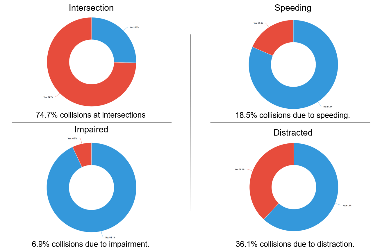{fig-align="center"}Analysis: From these various pie charts, we see that 74.7% of accidents occur at an intersection, 18.5% due to the driver speeding, 6.9% due to the driving being impaired, and 38.1% due to the driver being distracted. Based on these results, we recommend that drivers take particular caution at intersections. It might also be beneficial to enforce stricter regulations on distractions such as being on the phone.## **Conclusion**We demonstrate a successfully-designed Quarto dashboard that allows the user to see a substantial amount of statistics related to car accidents in Tucson. With a deep commitment to applying our analytical skills for the betterment of our community, we believe that this project represents a meaningful opportunity to make a tangible difference in the area of road safety in Tucson. We are excited about the potential of our interactive spatiotemporal visualization tool to inform Tucson drivers on best driving practices that can lead to positive changes in our community.
